[Font] Brandon Text
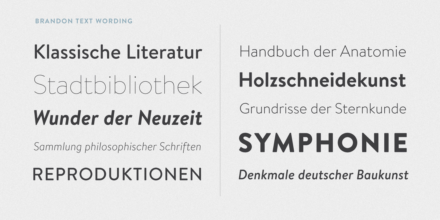
Brandon Text 是被設計用來搭配著名的 Brandon Grotesque 系列字體, 它擁有較高的基本高度 (x-height), 比起 Grotesque 來說更適合應用在字幅較長的段落和小尺寸的裝置螢幕。
Brandon Text is the companion of the famous Brandon Grotesque type family. It has a higher x-height than the Grotesque version and is optimized for long texts, small sizes and screens.
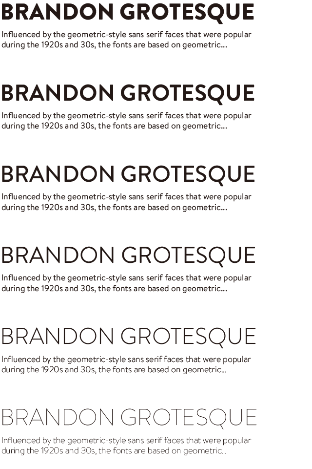
總共有六種不同 粗細/字重 (weight) 和斜體的無襯線字型是在 2012 年由 Hannes von Döhren 所設計的。
This sans serif type family of six weights plus matching italics was designed by Hannes von Döhren in 2012.
受到在20到30年代間很流行的無襯線幾何造形風格的影響,這種幾何形狀的字體在閱讀上能有更好的視覺辨識性與易讀性。Brandon Text 看起來相當舒服,並可與 Brandon Grotesque 可以完美的搭配在一起。為了在螢幕的呈現而作了許多微調和優化所以把它運用在網站、電子書與應用程式上是個不錯的選擇。
Influenced by the geometric-style sans serif faces that were popular during the 1920s and 30s, the fonts are based on geometric forms that have been optically corrected for better legibility. Brandon Text has a functional look with a warm touch and works perfectly together with Brandon Grotesque. It is manually hinted and optimized for screens, so it will be a good choice for Websites, eBooks or Apps.
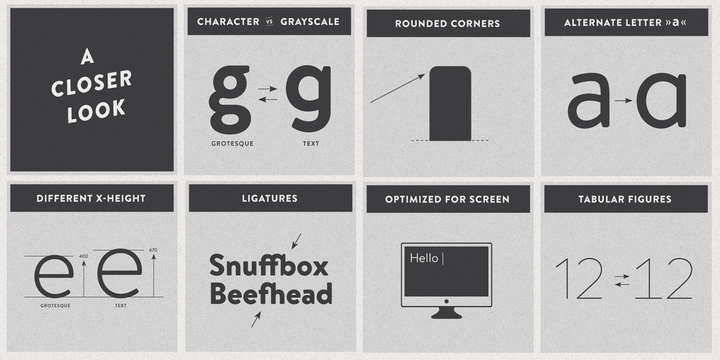
The whole Brandon series is equipped for complex, professional typography with different sets of numbers, alternate letters, fractions and an extended character set to support Central and Eastern European as well as Western European Languages.