Inanna Identity Design: The Royal Silhouette of the Sumerian Goddess of Love and Beauty
Brand Mythology & Context
Inanna is the revered ancient Sumerian goddess of love, beauty, fertility, and sovereignty—historically crowned the “Queen of Heaven.” Unique in ancient mythologies, she personified both divine authority and tender feminine grace.
In developing the visual identity for INANNA, the creative mission was to articulate “divine feminine empowerment and quiet confidence.” Through the harmony of classical silhouette portraiture and sacred iconography, the identity strikes a delicate balance between royal prestige and organic purity.
1. Interwoven Symbolic Architecture
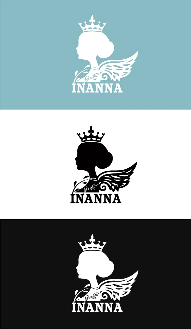
The logomark unites four harmonious symbolic motifs:
- The Noble Female Silhouette: Clean, flowing contours capture a timeless profile portrait crowned by an elegant updo, projecting poised grace, calm composure, and timeless allure.
- The Sovereign Crown: Resting gracefully atop the head is an ornate royal crown featuring fleur-de-lis motifs, signifying independence, self-possession, and unquestioned dignity.
- The Ethereal Angelic Wings: Feathery wings gently unfurl from behind her shoulder. This pays homage to Inanna’s mythological role as a heavenly celestial deity, while serving as a modern metaphor for freedom and transcendence.
- Botanical Flourishes: Curling vine tendrils and delicate leaves weave across the neckline, softening the regal geometry and infusing the mark with botanical vitality, organic nourishment, and natural serenity.
2. Color Palette & Typographic Harmony
- Color Strategy:
- Dusty Teal / Sage Blue: The signature hue evokes the serene, understated luxury of fine apothecary packaging and boutique salons, inspiring tranquility, trust, and refined sophistication;
- Timeless Monochrome: The black and white variations offer high-contrast adaptability, excelling across hot-foil stamping on rigid boxes, embossed hangtags, glass cosmetic bottles, and digital screens.
- Typographic Foundation: The INANNA logotype beneath the illustration employs a sturdy, authoritative Slab Serif. Its bracketed geometric serifs anchor the airy, delicate lines of the illustration above, creating visual equilibrium between ethereal elegance and rock-solid brand reliability.