Brandon Text: A Geometric Sans Reimagined for Body Copy and Screens
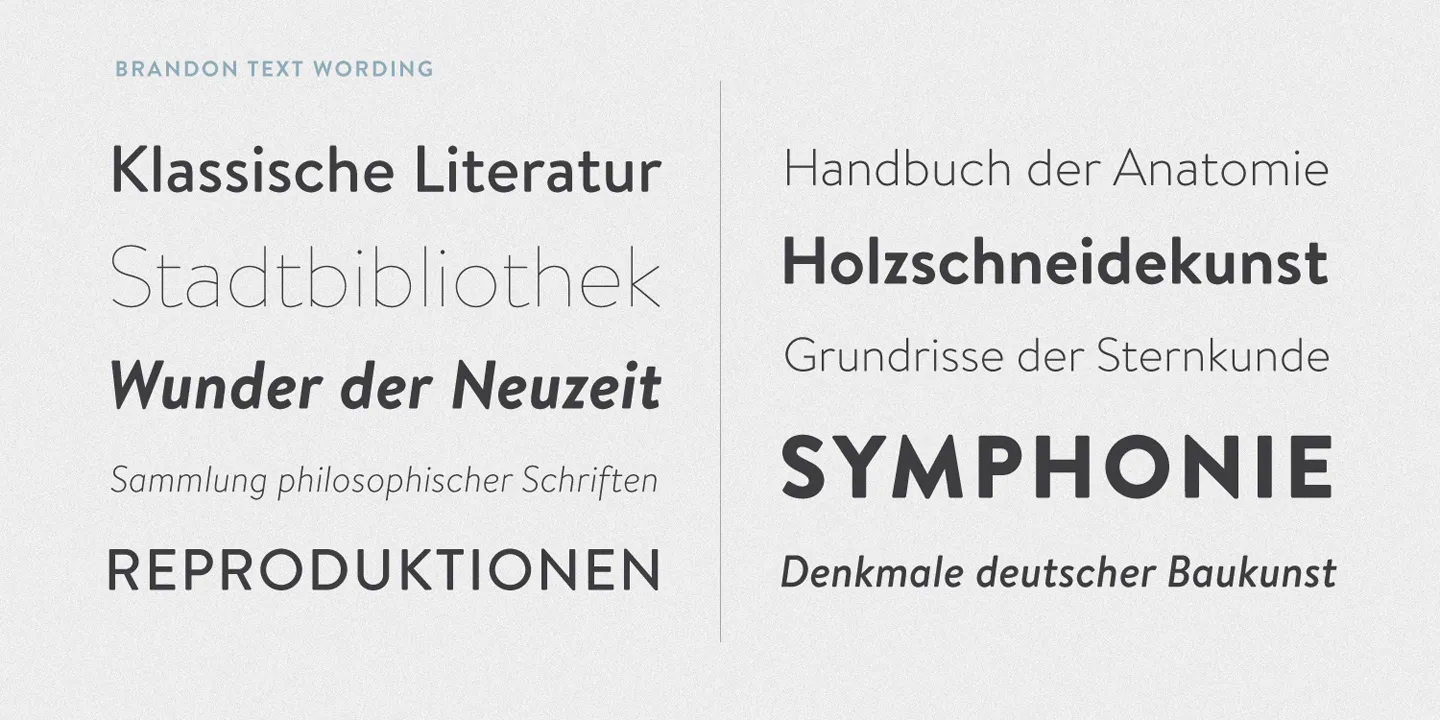
In the landscape of modern type design, Brandon Grotesque—created by German type designer Hannes von Döhren (HVD Fonts) between 2009 and 2010—stands as one of the most defining geometric sans serifs of the modern era. Drawing deep inspiration from the geometric elegance of 1920s and 1930s Art Deco and Bauhaus styles, it swiftly captured the design world across branding, editorial covers, and posters, winning the prestigious Type Directors Club (TDC) award in 2011.
Yet, like many classic geometric sans serifs (such as Futura), it encountered an intrinsic challenge: while its geometry produces arresting headlines, its relatively low x-height and sharp, circular silhouettes can cause fatigue when deployed in running body text or on compact digital screens.
To address this demand without losing the family’s distinctive spirit, Hannes von Döhren released Brandon Text in 2012 as a dedicated body-text companion.
1. From Display to Body: Key Evolutions in Brandon Text
Brandon Text is far more than a scaled-down Brandon Grotesque. It is a thorough, optical rethink tailored specifically for continuous reading, smaller point sizes, and screen rendering.
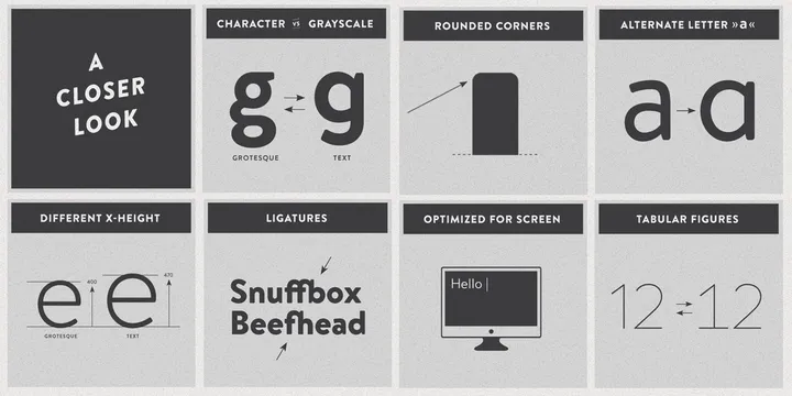
1. Significantly Higher x-height
The primary culprit behind poor legibility in geometric typefaces at small sizes is a modest x-height. Brandon Text increases the x-height from Grotesque’s 400 to 470—a boost of nearly 17.5%. Without inflating overall line spacing, this opens up inner counters, keeping lowercase letters distinct and legible even on mobile screens or at 12–14px sizes.
2. Streamlined Character Forms (Character vs. Grayscale)
In Brandon Grotesque, the lowercase g features an intricate, two-story loops-and-link construction. While visually striking at display sizes, this complexity creates unwanted “ink traps” and uneven dark spots (grayscale inconsistency) in dense paragraphs.
Brandon Text introduces a streamlined, open single-story g and refines critical curves such as the lowercase a, preserving a smooth and balanced rhythmic texture across paragraphs.
3. Preserving the Warmth: Subtle Rounded Corners
Geometric sans typefaces often carry a cold, clinical, and uncompromisingly industrial feel. What gives the Brandon family its enduring charm is the softly rounded treatment at the stroke terminals. This optical refinement subtly evokes the warm impression of letterpress inks on paper, infusing rational geometry with human warmth.
4. Dedicated Screen Optimization
Engineered for digital surfaces, Brandon Text features manual hinting to snap stems and curves accurately to the pixel grid, minimizing blurry anti-aliasing artifacts on lower-resolution screens and rendering crisply on high-DPI Retina displays.
2. A Comprehensive Typographic Toolkit
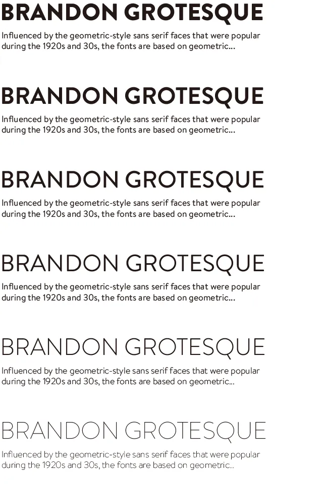
Brandon Text comes in six well-proportioned weights (Thin, Light, Regular, Medium, Bold, Black), each paired with carefully drawn true italics.
In addition to its refined proportions, the family provides full OpenType capabilities:
- Tabular Figures: Uniformly pitched numerals that align neatly across columns in financial statements, dashboards, and price lists.
- Refined Ligatures & Alternates: Including classic
fiandflligatures, delivering an elevated, polished typographic texture. - Extensive Language Support: Broad coverage spanning Western, Central, and Eastern European character sets.
3. Typography Pairing in Practice
In branding and interface design, pairing Brandon Grotesque + Brandon Text provides a harmonious typographic hierarchy:
| Hierarchy | Recommended Font | Use Case | Typographic Rationale |
|---|---|---|---|
| Display / Headings | Brandon Grotesque | H1 / H2, Hero banners, advertising copy, brand logotypes | Lower x-height and pronounced geometry project a sophisticated, retro-modern personality |
| Body / Interface | Brandon Text | Body paragraphs, navbars, input fields, button labels, mobile UI | Higher x-height and open forms ensure effortless legibility and reading comfort at small sizes |
By bridging the gap between expressive geometric styling and functional readability, Brandon Text allows designers to enjoy the warmth and character of 1930s-inspired geometry without compromising legibility—making it a stellar choice for editorial websites, eBooks, and modern applications alike.