SIGMA Global Vision: The Minimalist Web Design That Rebranded an Optical Titan
In the history of photographic gear, the bold reinvention initiated by SIGMA CEO Kazuto Yamaki in 2012—known as SIGMA GLOBAL VISION (SGV)—stands as a masterclass in brand transformation and industrial design strategy.
For decades, third-party lens manufacturers were often pigeonholed as “budget alternatives,” burdened with perceptions of utilitarian plastics and compromise. The SGV initiative decisively dismantled that stigma. By reorganizing their entire lens catalog into three distinct lines (Art, Contemporary, and Sports), committing to all-metal barrels, achieving class-leading optical resolving power, and championing 100% “Made in Aizu, Japan” craftsmanship, Sigma elevated itself into a revered benchmark of modern optical luxury.
To inaugurate this new chapter, Sigma launched sigma-global.com—a digital flagship that quickly became a celebrated triumph of minimalist web design and editorial sophistication.
1. The Landing Page: A Dialogue of Optical Geometry
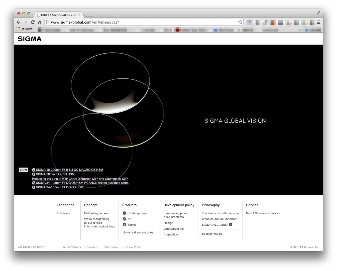
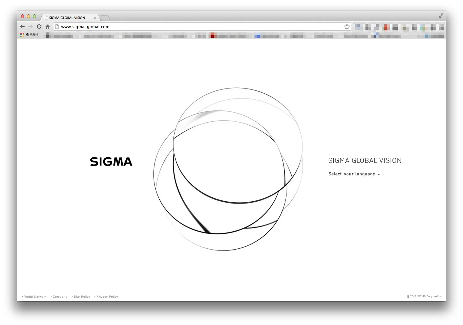
Opening the landing page reveals no aggressive marketing banners or noisy promotional popups. Instead, visitors are welcomed by a sea of pure negative space, a crisp black logotype, and a sublime cluster of overlapping circular geometric curves at the center.
This abstract motif evokes the cross-section of optical lens elements and light paths refracting through glass. Through delicate line weights and subtle curvatures, the graphic conveys depth, curvature, and refractive precision on a two-dimensional canvas. It is a design solution rooted deeply in optical physics, yet carried out with the grace of high modern art.
2. Monochrome Discipline: Letting Craftsmanship Command the Spotlight
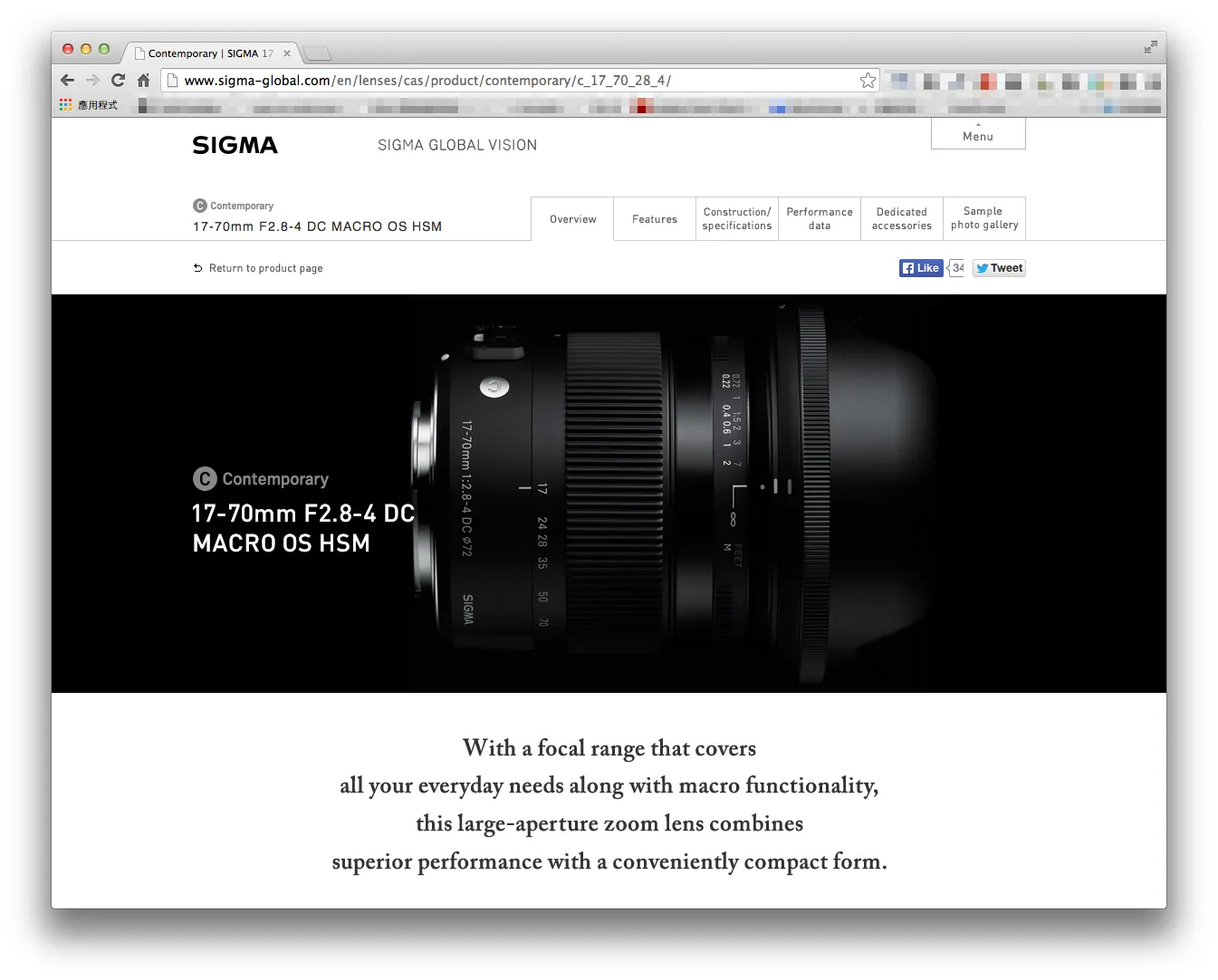
Navigating into product showcases transitions the background into deep, velvety black.
The color palette is strictly disciplined, composed entirely of black, white, and subtle shades of gray. This restraint creates an art-gallery stage where physical product textures take center stage:
- The crisp, brushed reflection of the solid brass bayonet mount;
- The tactile micro-knurling on the rubber focus and zoom rings;
- The subtle emerald and magenta reflections dancing across multi-coated front glass elements.
By stripping away extraneous visual ornamentation, the viewer’s attention remains completely uninterrupted, projecting uncompromising precision and understated luxury.
3. Editorial Elegance: Pacing Inspired by Fine Art Magazines
At the time, typical camera manufacturer websites (such as Canon, Nikon, and Sony) were cluttered with dense spec sheets, convoluted cascading dropdowns, and fragmented promotional blocks.
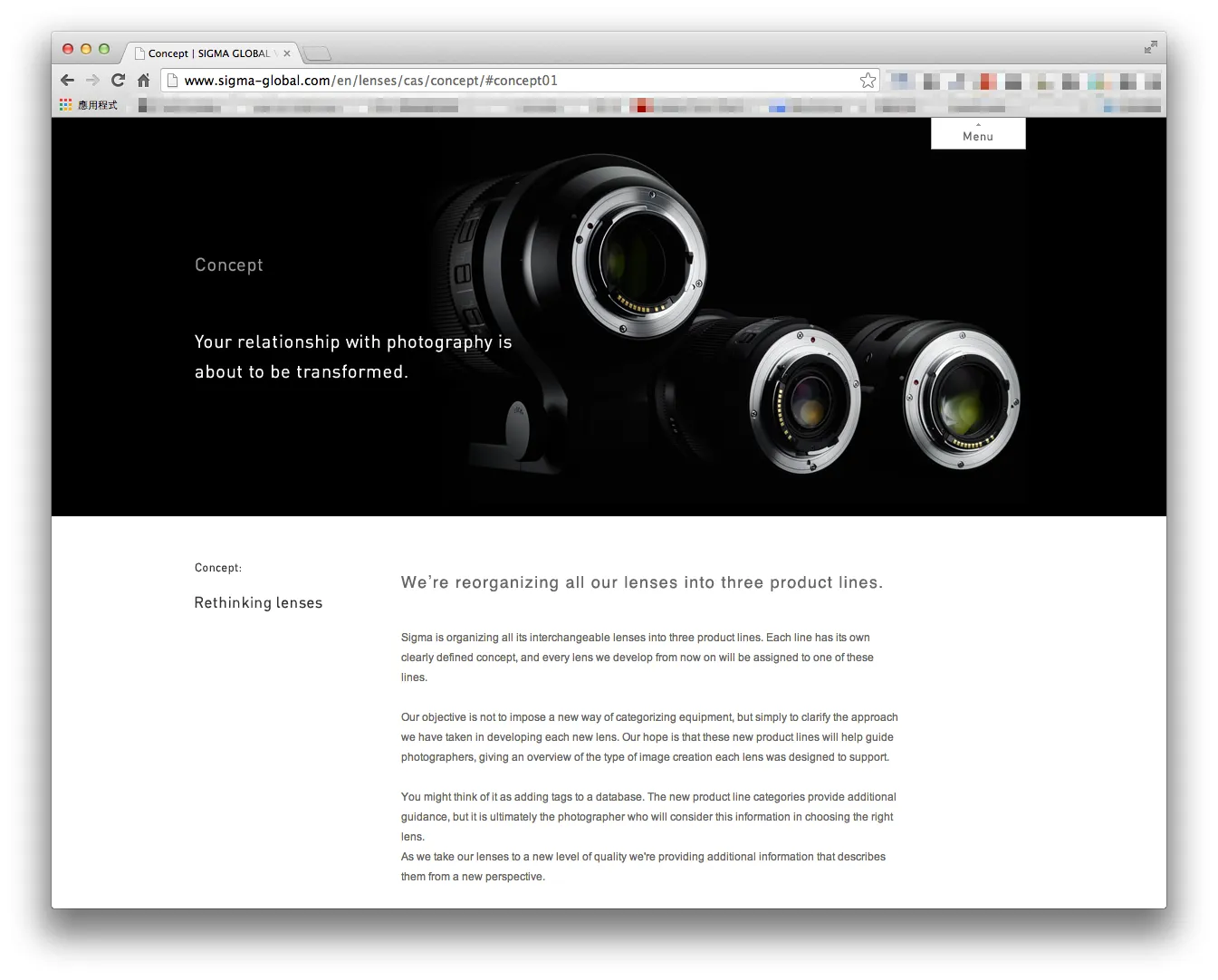
SIGMA Global Vision took the opposite approach, embracing the typographic rhythms of independent print publications and fine art monographs:
- The Swiss Grid System: Disciplined column structures and deliberate asymmetrical white space allow lengthy philosophy essays and extreme close-up product photos to breathe effortlessly together.
- Refined Serif Headlines: While navigation and body copy use clean modern sans-serifs, core statements and primary headers employ warm, literary serifs (“Your relationship with photography is about to be transformed.”), infusing the technological discourse with gravitas and warmth.
- Restrained Information Architecture: Technical deliverables (diffraction and geometrical MTF charts, internal optical diagrams, aperture blade counts) are tucked neatly inside minimalist secondary tabs. General visitors absorb evocative narratives and sample galleries, while pixel-peeping professionals still access deep engineering data on demand.
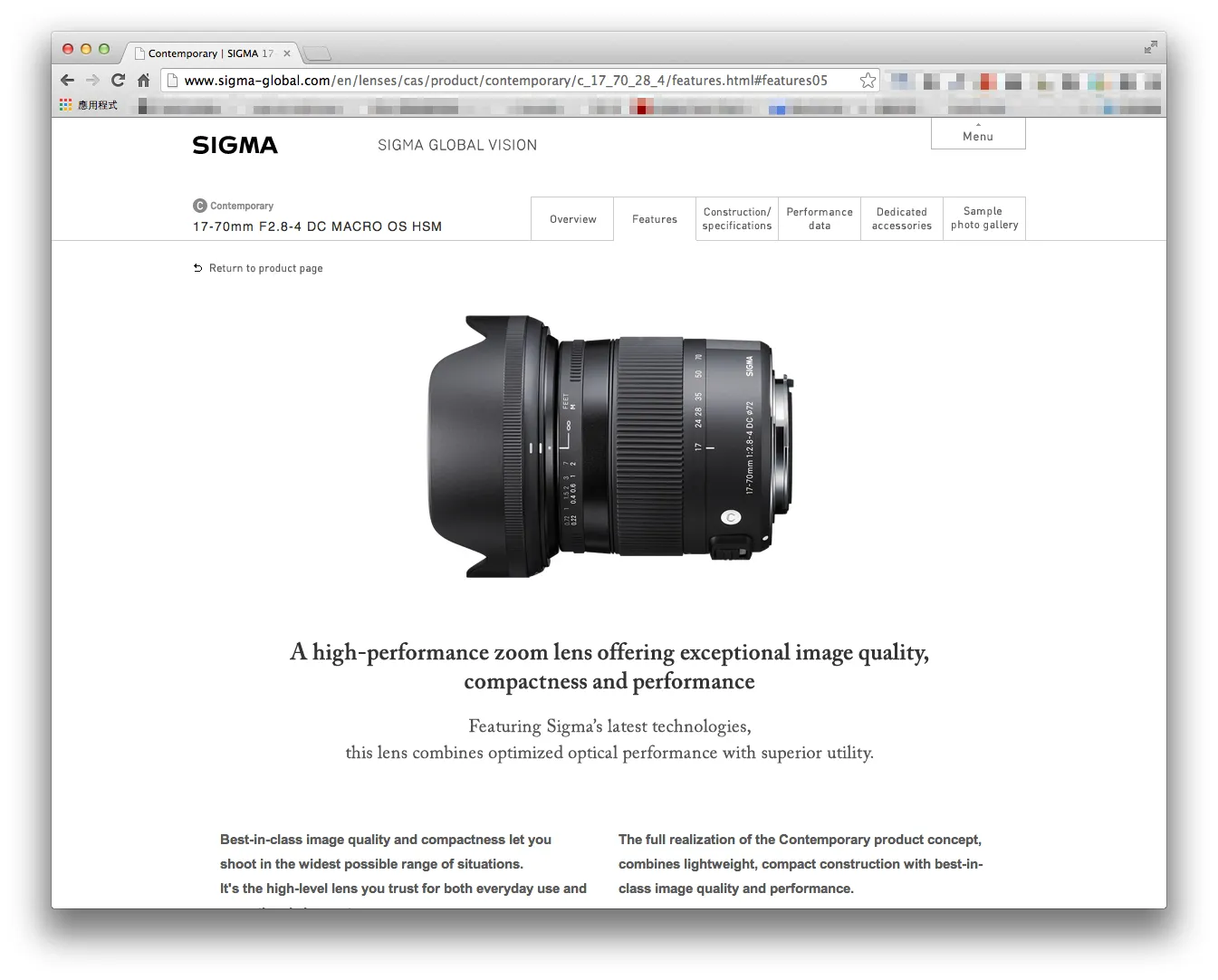
4. The Unified Triad: C・A・S Product Architecture
The website cleanly communicates the core organizational logic of the SGV philosophy:
| Line | Core Philosophy | Engineering Characteristics |
|---|---|---|
| A (Art) | Uncompromising optical performance and artistic expression | Built without compromise to achieve peak sharpness and smooth bokeh; the quintessential large-aperture prime lineup |
| C (Contemporary) | Compact versatility for everyday creation | Balancing stellar optical performance with lightweight, portable dimensions across standard and superzoom lenses |
| S (Sports) | High-action velocity and weather-sealed resilience | Rugged weatherproofing, rapid autofocus, and extreme telephoto reach engineered for wildlife and sports photography |
Using uniform circular letter badges (A, C, S inside subtle gray medallions), the catalog clarifies what was once an overwhelming labyrinth of focal lengths and acronyms, allowing photographers to intuitively find the exact tool matching their creative vision.
Conclusion: Web Design as the Extension of Brand Soul
The SIGMA Global Vision website proved that a digital presence is never just a specification sheet—it is the ultimate vehicle for communicating institutional dignity, philosophy, and craft.
Through disciplined geometry, monochromatic contrast, and generous white space, the design reflected absolute confidence in the quality of the glass itself. Years later, it remains an enduring benchmark for how industrial technology can be celebrated through digital design.